Monday, December 8, 2008
Fantastic New TeleGeography Map
The folks at TeleGeography have just posted a new map entitled "The Global Internet Map". According to their press release this new map:
...illustrates the the key Internet connections that link the countries and the five major regions of the world. Regional close-up maps detail the primary intra-regional Internet routes in Europe, Asia, North and Latin America, and Africa. Nine accompanying figures and tables present valuable data about Internet bandwidth by country, regional and global Internet capacity growth, service providers, traffic by application, wholesale IP transit pricing, and broadband user growth.
This is certainly the most comprehensive, well designed, current map out there of the physical infrastructure of the internet that I have seen. I've posted on previous maps of theirs before.
Wednesday, December 3, 2008
Mapping Internet Traffic
There are a few sites out there that visualize internet "traffic" in real time.
Internet Traffic Report shows a very basic stop-light style map using volume, response time and packet loss as indicators.
Internet Health Report shows packet loss rates by internet service provider on a heatmap-style color scale, with data refreshed every 15 minutes.
Internet Weather Report used to be hosted at www.mids.org, however as far as I can tell that site is no longer functioning. It's a shame, though, because this site provided doppler-radar style MPEG movies of conditions on the internet. The image above is a still from the Boston area.
About the project:
These maps show round trip times from our offices to approximately 4,500 domains worldwide, currently every four hours, six times a day, seven days a week, using ICMP ECHO (ping).
UPDATE: Caida, which I've blogged about before, also has a number of visualization tools here
Monday, November 17, 2008
ShowWorld - animated maps
ShowWorld is building on the equal area cartograms I just posted on from WorldMapper but animating them the way we've seen Hans Rosling demonstrate at TED and through the Gapminder site. Right now the data isn't deep enough to see timelapse on the categories of 'internet users' or 'broadband', but the interface is slick and looks promising for the future.
Worldmapper - Distribution of Internet Users
A collaboration between University of Sheffield and University of Michigan professors, Worldmapper creates a wide range of "equal area cartograms." These are maps that resize the territory of each country according to a variable. In honor of Geography Awareness Week, check out their innovative approach to visual cartography. Worldmapper website.
The map pictured is the distribution of the 631 million internet users worldwide in 2002. It's interesting to compare this with the same data from 1990. According to Worldmapper, the number of people using the internet increased by 224 times during this period.
"The distribution of Internet users worldwide has changed remarkably over just a dozen years. In 1990 Internet users were mainly found in the United States, Western Europe, Australia, Japan and Taiwan. By 2002 people living in Asia Pacific, Southern Asia, South America, China and Eastern Europe were notable Internet users. A not insignificant number of Internet users are also shown to be in Northern Africa, Southeastern Africa and the Middle East."
Sunday, October 12, 2008
DeviantArt Map
Artist 'darkdoomer' on DeviantArt posted this graphical representation of the internet. A self-titled 'work in progress' this map echoes (and in some cases directly borrows from) other conceptual maps I've blogged on such as XKCD and its Polish cousin. darkdoomer's version steals a few pieces directly from XKCD, including 'Sea of Memes', updates the content a bit and includes more detail, but like XKCD still doesn't use the relative area or shape of the 'landforms' to communicate much of a view on the internet's underlying form.
Tuesday, September 30, 2008
Looking back - BBC Article
I just came across this BBC article from 1999 on mapping the internet. Internet cartography has certainly become more sophisticated since this was written, but it's interesting to look back and see that the big questions remain the same: how do you produce a map of something for which distance is irrelevant? what are the units of measurement - servers, people, IP addresses?
Wednesday, September 10, 2008
10 Years of Internet Images
Today Information Week published a Gallery entitled "10 Years of Internet Images." Some of these I've posted on before, but there were some great examples I hadn't seen that map the idiosyncracies of some of the world's more isolated/disrupted networks such as Iran and Cuba. The map shown above is of the Yugoslavian network during the Balkan Wars circa 1999.
"These two images come from Yugoslavia between March and July 1999, during the NATO bombing of the country. The dips in the lower image represent infrastructure going offline and traffic re-routing to adjust itself. Markulec says this information can be valuable for war fighters because it shows the impact on a communications infrastructure, where and how communications are being restored, and where the greatest points of weakness exist."
Tuesday, August 26, 2008
Dashpoet
This colorful, happy design from dashpoet.com is a "map" of links to children's websites. Link
Dashpoet.com features a number of "original internet maps" all using bright colors and simple design. Maps include news, travel, shopping, football, museums, music and more.
Monday, August 25, 2008
Mapping the Digital Divide in Africa
In 2005 Acacia published an atlas full of fantastic maps on this topic. Acacia is an information and communication technology initative in sub-Saharan Africa. The map shown here is a measure of the ICT Opportunity Index, which combines "ITU's Digital Access Index and Orbicom's Monitoring the Digital Divide/Infostate conceptual framework and model."
Page 16 also has a great map on the affordability of the internet in Africa.
I'd love to see this updated - it's the most comprehensive mapping of internet and telephony infrastructure and access that I've seen.
Thursday, August 7, 2008
TouchGraph
TouchGraph is a free Java application focused on visualization of web-based information and designed to help people explore the connections between related websites.
The TouchGraph Google Browser reveals the network of connectivity between websites, as reported by Google's database of related sites.
Wednesday, July 23, 2008
Distribution of NY Times Online news
Here is another map illustrating the distribution of online news stories over world geography.
This map shows world countries shaded according to the number of search results from the last year at nytimes.com divided by the number of citizens in each country. Link
Wednesday, June 25, 2008
Ambiguous map from 2007
This 2007 map by ExploMap shows a distribution of websites over a world map. Their website says it is "based on the websites world classification carried out by Alexa and ComScore. The websites traffic is correlated with the surface of the countries." I wasn't able to tell from their site whether the most "popular" website in each country is listed or if this is relating the relative surface area of countries to the corresponding size/traffic of major websites. (the second seems more plausible given some of the site names...any insight out there on this?) Link to full map
Wednesday, May 7, 2008
VerveEarth
VerveEarth plots out blogs by their (self-identified) geographic location (look for Internet Geography in Stamford, CT). Described as "a new way to reach your favorite websites and surf the net," VerveEarth lets you navigate by categories listed across the top and, if you register, you can mark your favorite "destinations." The clean google maps interface brings a nice visual experience to literally travelling the web.
Tuesday, May 6, 2008
Navigate the Webby Award Winners
UPDATE: The 2008 Winners have been announced, using the same interactive interface.
7/24/2007 Post:
The Webby Award people have posted an interactive interface to explore all those award-winning 2007 websites.
Thursday, April 24, 2008
Informational distance between cities
This is a visualization of the "informational distance between cities" as measured by the "google proximity" and geographic distance...all explained on this very simple and beautiful site.
via infosthetics.com
Monday, April 21, 2008
2008 Webware 100
The winners for 2008's Webware 100 are just out and the winner's list is a nicely categorized directory of what's great on the web right now.
Web 2.0, 3.0, 4.0....
This may have been out there for a while, but I just came across this basic visual representation of the evolution of the web over time.
Via webware.com
http://i.i.com.com/cnwk.1d/i/bto/20080418/webtimeline.jpg
Friday, April 18, 2008
Geographic coverage of media sources
An article in L'observatoire des Medias shows a project to capture the geographic coverage of major media outlets. Interesting to compare traditional media to online-only to "the blogosphere" (which is shown above).
From the article:
The cartograms below show the world through the eyes of editors-in-chief, in 2007.
Countries swell as they receive more media attention; others shrink as we forget them
Heat-mapping internet search terms by country
Lifehacker and Google Blogoscoped posted how-tos on using Google Spreadsheets to create a world map illustrating how much a given search term relates to different countries. The example in their post shows concentrations in Brazil and Russia for the keyword "samba"
Tuesday, April 15, 2008
Visual Search Engines
Infosthetics.com has a good summary of emerging visual search engines posted today. SearchMe's tag line is "you'll know it when you see it" which really gets to the key challenge of navigating a text-based internet for visual people.
Thursday, April 10, 2008
Internet Reachability
The University of Washington's Hubble system tracks unreachable areas of the internet in real time.
From their website:
Having trouble accessing a favorite Web site? Perhaps the site was taken offline, or the computer hosting it is down for maintenance. However, the cause could be something more mysterious. At any given moment, a portion of Internet traffic ends up being routed into information "black holes." These are situations where advertised paths exist to the destination, but messages - a request to visit a Web site, an outgoing e-mail - get lost along the way. Hubble is a system that operates continuously to find persistent Internet black holes as they occur.
Tuesday, April 8, 2008
MoMA's Design and the Elastic Mind
There is an incredible exhibit on right now at MoMA that is right up this blog's alley.
See also a nice summary from Creative Review.
Wednesday, March 26, 2008
Geographic preferences for social networking platforms
A breakdown by continent and country of social networking sites' relative dominance. Link. via the publics
Tuesday, March 18, 2008
Sir Tim Berners-Lee's Growth of the Internet
Monday, March 10, 2008
Friday, February 29, 2008
Longitudinal View
A representation of the internet by longitude, from the Cooperative Association for Internet Data Analysis.
From CAIDA's site:
This visualization represents a macroscopic snapshot of the Internet for two weeks: August 1st, 2007 through August 15th, 2007. The graph reflects 760,922 IP addresses and 1,400,796 IP links ... We aggregate this view of the network into a topology of Autonomous Systems (ASes), each of which approximately maps to an Internet Service Provider (ISP). We map each IP address to the AS responsible for routing it, i.e., the origin (end-of-path) AS for the best match IP prefix of this address observed in Border Gateway Protocol (BGP) routing tables. Eighty percent of ASes with known locations are placed in the Americas, Europe/Africa, and Asia/Oceana.
via millsworks
Saturday, February 16, 2008
Country domain mapping
Zooknic.com maps the relative distribution of domains in Google Earth using the concepts of political and technical location.
Wednesday, February 13, 2008
Undersea Internet
This map from the Guardian UK shows the undersea cable network supporting much of the world's internet access. (source: braincubes.be)
Saturday, January 26, 2008
Internet bandwidth map
This is old news, but TeleGeography published an updated Global Internet Map in 2006 showing "international internet bandwidth, scaled by capacity—covering backbones operated by more than 300 international Internet carriers as of mid-2005" ... in any case, it's $225 so I probably won't buy it to see the detail, but in the interest of compiling a more comprehensive collection of what is available, I am posting on it. The 2001 version looked good too.
Saturday, January 5, 2008
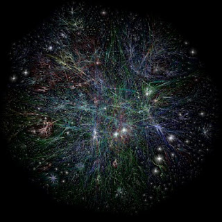
Opte Project
One of the original widely viewed representations of the internet from the Opte Project (2003 I think). Captures the organic fractal-like development of the web.
Subscribe to:
Posts (Atom)